This is a report from our "winter" NWEA assessments. It shows which students achieved high scores on the tests, as well as how well they did or did not improve since the battery of tests they took at the beginning of this school year. Three students moved away, and two moved in, but our two newest do not have previous scores to justify their placement on this particular chart.
The green plusses indicate math scores, while the purple squares represent reading, and the gray pentagons are language scores. Red rhombii show results for Science. Ideally, we want as many students in the green quadrant, showing that they have achieved high scores and increased by a significant amount. Those students in the pink zone are the ones with the most concern. The ones in yellow have decent scores, but did not make much progress in the last year, and the orange section is for students who improved, but still did not score high enough.
The green plusses indicate math scores, while the purple squares represent reading, and the gray pentagons are language scores. Red rhombii show results for Science. Ideally, we want as many students in the green quadrant, showing that they have achieved high scores and increased by a significant amount. Those students in the pink zone are the ones with the most concern. The ones in yellow have decent scores, but did not make much progress in the last year, and the orange section is for students who improved, but still did not score high enough.
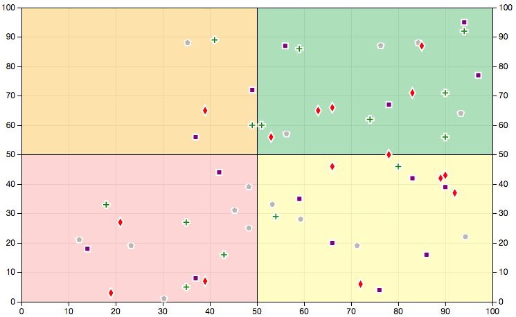
Everything here is based on the 50th percentile, meaning the yellow and green quadrants are for individuals who scored higher than the half of the students who took the test nationwide, and the green and orange quadrants display students who improved more than half of the students who were tested.
Here are some observations:
Here are some observations:
- High achievement: Math - 8 students; Reading - 9 students; Language - 8 students; Science - 7 students
- High improvement: Math - 8 students; Reading - 5 students; Language - 5 students; 11 students
- Low achievement: Math - 6 students; Reading - 5 students; Language - 6 students; Science 8 students
- Low improvement: Math - 6 students; Reading - 9 students; Language - 9 students; 4 students
- Close to the high achievement line (Raising scores could move them to the right side of the chart.): Math - 3 students; Reading - 2 students; Language - 3 students; Science - 5 students
- Close to the high improvement line (Significant improvement could move them to the top half of the chart.): Math - 1 student; Reading - 2 students
- Close to high achievement and high improvement lines (A higher score and decent improvement could move them from the pink to the green.): Reading - 1 student; Language - 1 student